Visual Brand
- Color
- Typography
- Graphic Elements
- Photography
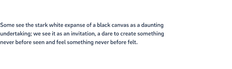
UC San Diego is passionate about telling our story and connecting with the world through our messaging. Typography plays an extremely important role in ensuring that our content is dynamic, recognizable and legible. Following is an overview of our primary brand fonts as well as recommendations for alternate fonts for flexibility across mediums. Together, these fonts create a vibrant and bold brand while having an easy-to-use system for university use.
The primary font for all university materials, Brix Sans is a modern sans serif that prides itself on legibility. Available in a wide range of weights, Brix can provide contrast and emphasis to establish clear hierarchy in text. Brix should be your go-to font for anything UC San Diego.
Brix is available for purchase from MyFonts.com.
If you do not have access to Brix Sans, Source Sans is our recommended alternate. Source Sans is a clean sans serif with a wide range of weights similar to Brix. Brix and Source Sans should never be used at the same time on materials. Source Sans can be downloaded from Google Fonts or accessed through the Canva platform.
If you cannot download Source Sans, Myriad Pro or Calibri (both available through commonly used software) may be used as a last resort; however, these are not recommended for use on external-facing materials.

Refrigerator Deluxe is a geometric condensed sans serif that is used primarily in headlines. Its bold yet grounded nature reflects UC San Diego’s spirit of curiosity and is perfect for high-impact designs.
Refrigerator Deluxe is available for use via Adobe Fonts for those with an Adobe Creative Cloud subscription. Individual licenses are also available. Visit marksimonson.com for purchasing options.
Teko is our recommended substitute for Refrigerator Deluxe. Teko is available to download for free from Fontshare and can be used on the Canva platform.

Chronicle is a transitional serif font that is both warm and adaptable. It is best paired with Brix for more formal occasions or for creating hierarchy in extended passages of text. Chronicle is available in both text and display versions. In most cases, use the text version when setting body copy. Use Chronicle sparingly in headlines — a sans serif such as Brix is usually more reflective of the campus.
Chronicle Text and Chronicle Display are both available from typography.com.

Most fonts are licensed on an individual user basis or for a specific medium (for example web). Licenses can vary based on the application you are purchasing for, so we recommend reading and understanding a font license prior to purchasing.
If you need help purchasing a license, please contact brand@ucsd.edu.
This is the recommended type hierarchy for standard use on materials. When in doubt, see the tips below.

H1 HEADING
Refrigerator Deluxe Heavy
All Caps
0 Tracking
85% Leading

H2 SUBHEADING
Brix Black
All Caps
175 Tracking
160% Leading

H3 EYEBROWS
Refrigerator Deluxe Extra Bold
All Caps
80 Tracking
130% Leading
BODY COPY
Brix Regular & Italic
0 Tracking
140% Leading
Ensuring that any content is legible and readable is essential for communication to all audiences. While certain aspects of type setting can vary based on scale and application, there are some basics that should always be considered:
Headlines often serve as the focal point on the materials we produce. While readability is crucial, ensuring visual interest and variation on materials is necessary to keep the audience engaged. UC San Diego’s headline styles are simple and bold, leveraging contrasting size, fonts and colors to amplify our message. All headlines should be set in our brand fonts — Refrigerator Deluxe and Brix.

CONTRASTING
COLORS

GRIT TEXTURE
IN TEXT

CONTRASTING
SIZE

CONTRASTING
FONTS