Visual Brand
- Color
- Typography
- Graphic Elements
- Photography
Graphic elements are the building blocks from which we can expand the UC San Diego brand visually. These graphic elements are not meant to curtail creativity but rather inspire and cultivate it. Use these elements to create a cohesive brand that is representative of the entirety of the university.
Download our UC San Diego Brand Toolkit for access to our full suite of graphic elements (use your UC San Diego email address to access the files on Google Drive).
The grit texture has many sources of inspiration, from the sandy beaches from which our university was founded to the creative and innovative spirit of our community. Used as a fill within shapes or as a texture that creates a two-toned gradient, the grit texture references the hands-on nature of the work being done here. Be sure to only use colors from the core and accent palettes when using these grit textures.
Within geometric shapes color on color grit texture can give the illusion of a dimensional sphere, whether it be two or three colors. Over a large fill of color, the grit texture can create an energetic gradient.
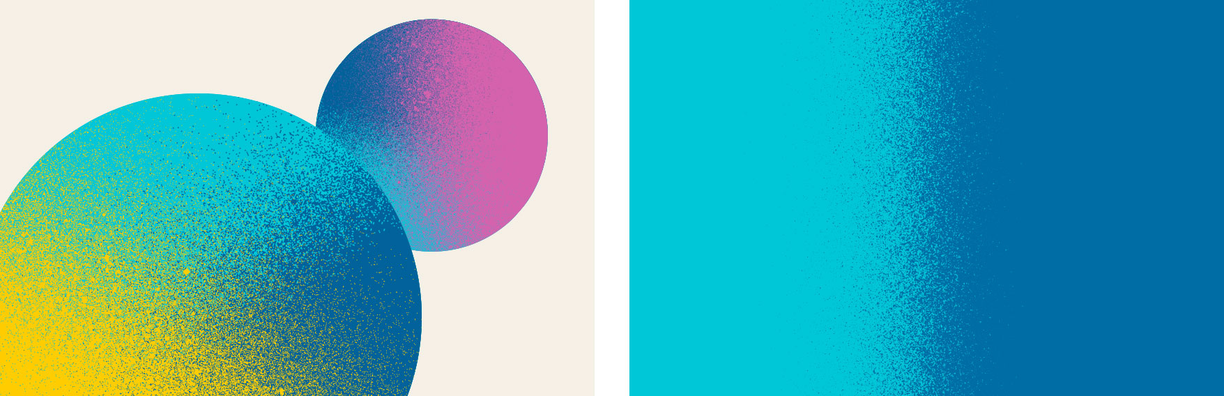
A color on transparency grit texture creates spatial interest in graphics. These color to transparent textures can be layered over photos, placed over other graphics and textures, or contained within small moments of type to create a sense of depth.
Download grit texture and circles
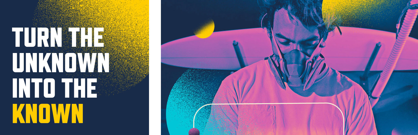
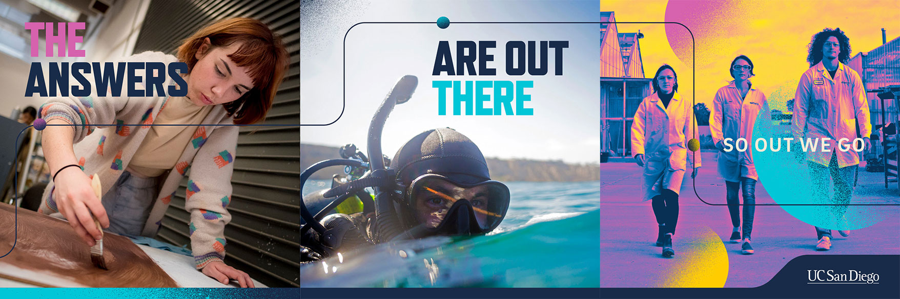
Circles and rounded rectangles create a sense of playfulness and warmth in the UC San Diego brand. These shapes can be used to create scale, depth and dimensionality in layouts, encouraging us to think further.
Shapes can be filled with photography, grit textures or solid colors and can serve many design purposes from adding texture and building patterns to creating focal points and housing copy. Paired with the gradient-mapping effect in photography, these shapes can create the illusion of another world while also providing movement and variety to compositions. When using these shapes in layouts, always be sure to balance exuberance with sophistication.

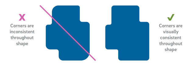
The shape and size of these elements should be customized based on the layout being produced to feel purposeful in the composition. To build, use a series of rectangles to create the base of the shape, ensuring they overlap. Next, combine the rectangles (using Pathfinder in Adobe products) to create one single shape. Finally, round the corners to ensure a consistent corner arc.
Read on for additional design considerations.
We recommend keeping corners consistent within a single shape or line.
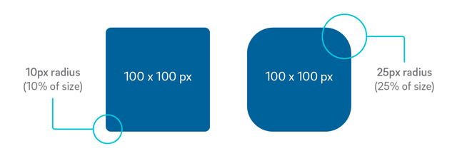
Ideal radius size is 10-25% of length of the shortest edge of your shape.
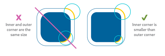
When nesting rounded corners, the inner corner should be smaller than the outer corner (the ideal inner radius is equal to the outer radius minus the distance between the two).
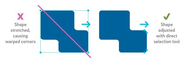
Be careful not to stretch or distort your corners when resizing your shapes or lines. To keep rounded corners uniform, either scale the element proportionately or use the direct selection tool to select and move desired vector points.
Thin line work, reflective of the underline in our logo, creates movement while also providing the ability to direct the viewer’s eye. When used as an artistic element in a composition, always start and end the lines at the edges of the layout to give the illusion that the line is a continuing path beyond what is seen. Horizontal or vertical rule lines can also be used to create systematic hierarchy in content. All line work should be a contrasting color from the background and always have rounded corners.
While line weights need to vary based on the size of an application (the size of a billboard versus a brochure spread), always err on the side of a thinner line weight.
UC San Diego’s abstract trident and library graphics were retired in 2023. These graphics are no longer brand compliant and must be discontinued or replaced as soon as possible.