Color Palette
UC San Diego’s surroundings provide a richness of color and character. Our color palette is inspired by the everyday sites found around campus.
While combinations of these colors are acceptable in print designs and other collateral, the campus logo must always appear in PMS 2767 and 1245 when reproduced in color (see the University Logo page).

No two colors represent our campus better than our alma mater blue and gold. Inspired by our two primaries, we created an expanded palette suitable for print and digital applications.
View our web color accessibility chart to see accessible brand color combinations.
Core colors
Pantone 2767
C100 M86 Y42 K42
R24 G43 B73
#182B49
Pantone 3015
C100 M35 Y3 K21
R0 G98 B155
#00629B
Pantone 1245
C6 M35 Y99 K18
R198 G146 B20
#C69214
Pantone 116
C0 M14 Y100 K0
R255 G205 B0
#FFCD00
Accents
Pantone 3115
C70 M0 Y16 K0
R0 G198 B215
#00C6D7
Pantone 7490
C60 M23 Y92 K5
R110 G150 B59
#6E963B
Pantone 3945
C3 M0 Y90 K0
R243 G229 B0
#F3E500
Pantone 144
C0 M51 Y100 K0
R252 G137 B0
#FC8900
Neutrals
Black
C0 M0 Y0 K100
R0 G0 B0
#000000
Pantone Cool Gray 9
C30 M22 Y17 K57
R116 G118 B120
#747678
Pantone 401
C10 M11 Y17 K27
R182 G177 B169
#B6B1A9
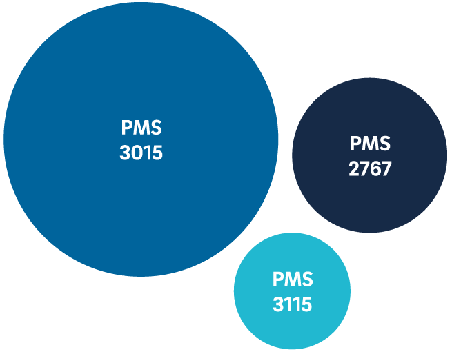
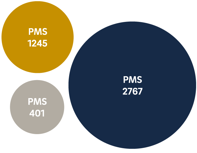
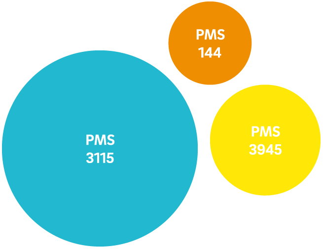
Your choice of colors should always include blue. For a secondary color, choose yellow or another blue. Other colors are meant to be accents and should not be the dominant color. Below are some examples.
Everyday

Formal
Bright
Monochromatic